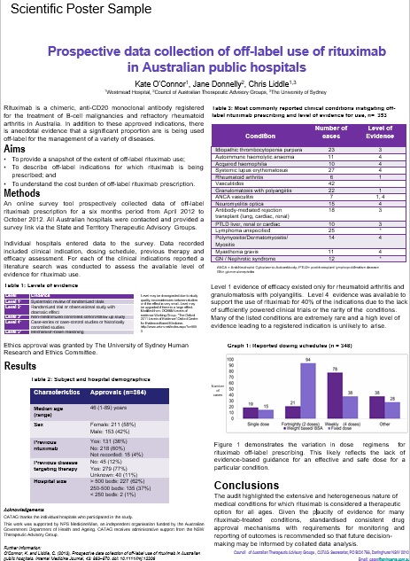
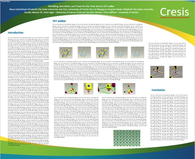
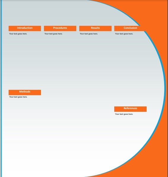
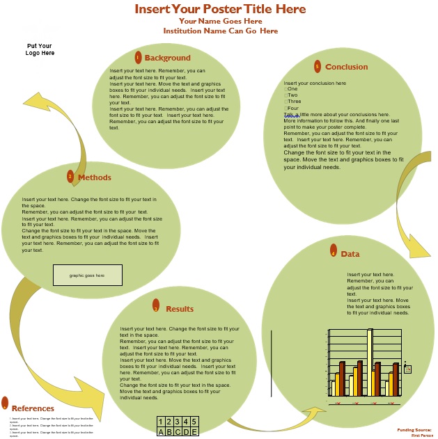
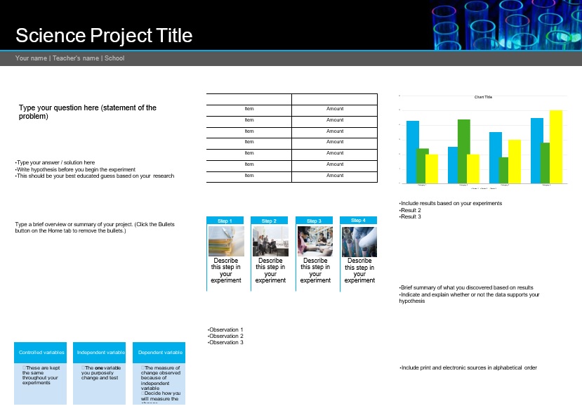
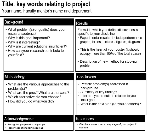
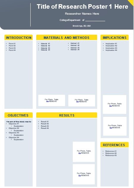
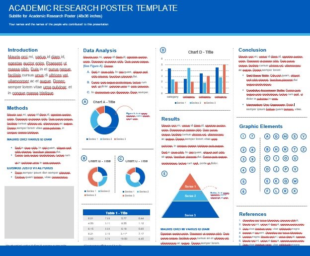
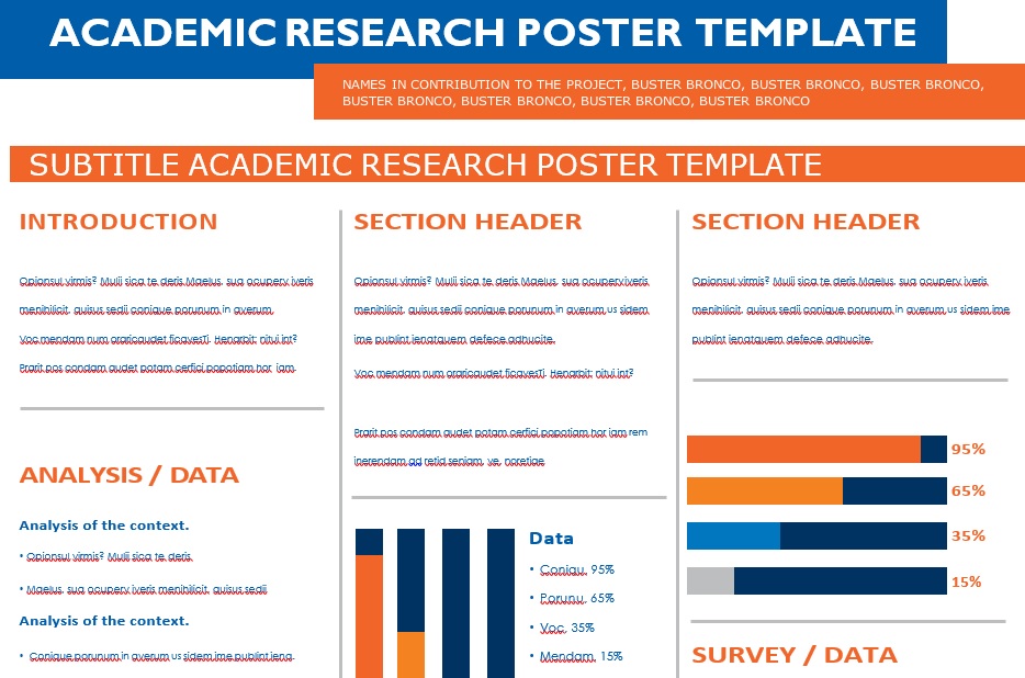
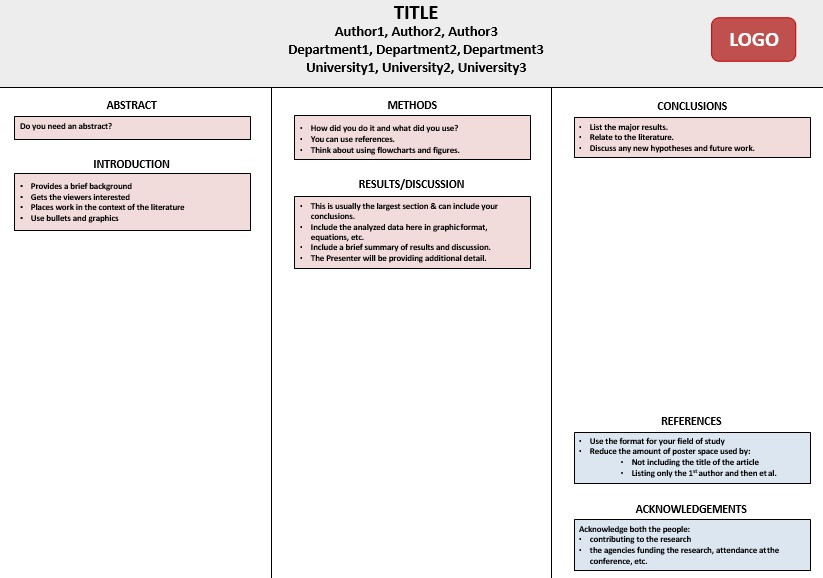
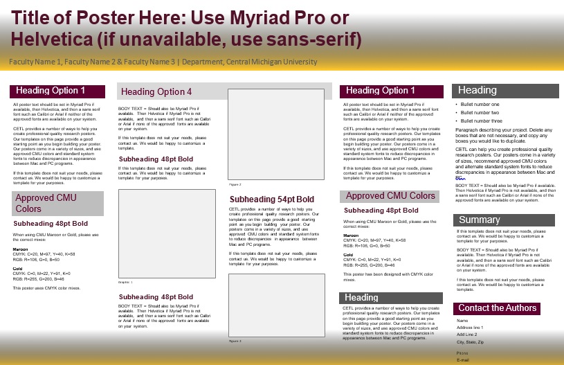
Research poster templates are extensively used in conferences, presentations, and more, and the academic community. They used research posters to summarize the research or information in a concise and attractive way. Then, they publicize this information and start discussions. Other names of research poster are;
- A scientific poster template
- An academic poster template
- A science poster template
Table of Contents
What is a research poster?
In the academic community, research posters are widely used. Poster presentations are included in most conferences. Information is summarized in research posters concisely and attractively. Also, it helps in publicizing it and generating discussion. It generally consists of a concise text mixed with tables, graphs, pictures, and other presentation formats.
How to make a good research poster?
Usually, a research paper includes a combination of pictures, tables, graphs, and other components used in presentations. Researchers use posters at conferences so that they can talk about the topic more effectively. However, in order to create an effective research poster, make sure that it should;
- You should make it completely readable from up to 10 feet away.
- It has a concise title that grabs the interest of the audience.
- It consists of not more than 800 words.
- Your text is both simple and precise.
- Make it easier to read with the help of headlines, numbering, and bullets.
- You should use different colors, fonts, and graphics effectively.
- Make its layout clean and consistent.
- Your research poster contains your name, the name of your institution, and acknowledgements.
Elements of a research poster:
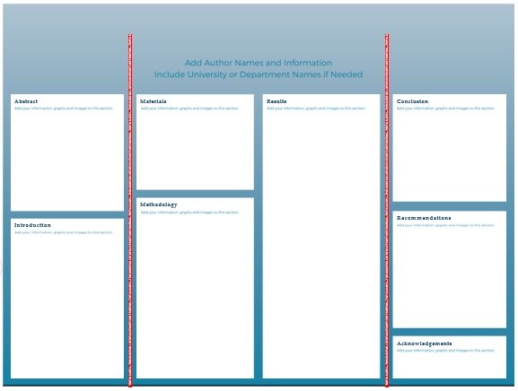
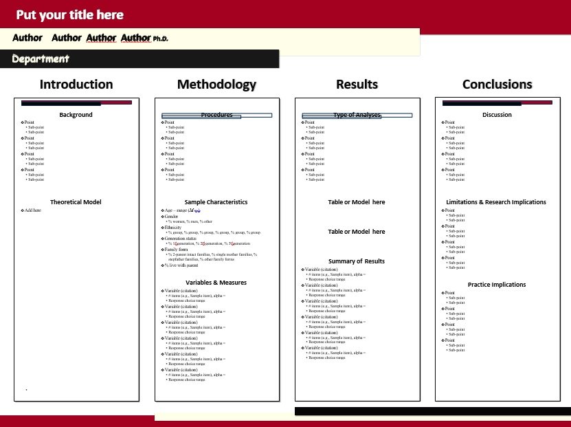
Organize your information into following main components or sections;
Introduction:
The stage for the rest of your poster is set by the elements in this section. Here, you should include the following so that the readers learn more about your research;
- Condensed
- Abstract
- Background
- Hypothesis
- Purpose or Objectives
Research:
In this section, you have to include all of the data you have gathered through your research and all the methods you used. This section contains most of the “meat” of your template. Therefore, think about it carefully.
- Materials
- Methodology
- Analysis
- Models
- Results
Conclusion:
This is the last section of your poster where you include the summary and analysis of your results.
- Recommendations
- Implications
- Discussion
- Acknowledgments
- Contact Information
According to your needs, you can also add more sections or elements. The aforementioned are the basic components that readers expect so you must focus on them. Furthermore, you should first answer these questions before creating your template;
- What information does your poster contain?
- Why do you want to make the poster? What do you wish to include to the discussion?
- During your research, what methods did you use?
- What outcomes did you come to?
- What are your suggestions depending on your research?
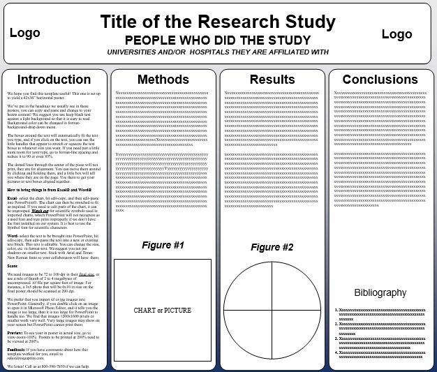
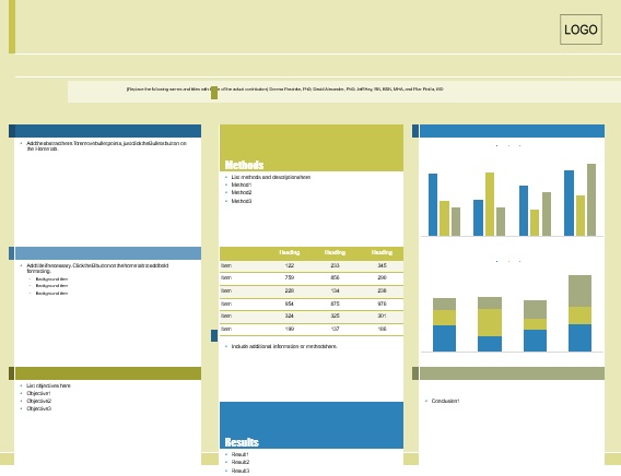
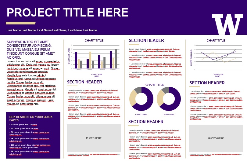
The academic and science poster templates have columns. They include a few sections in each column. From top to bottom, readers go through these columns. So, you should organize the information this way. This provides your readers a clearer picture of the poster’s contents.
The layout of the research poster:
Here are some tips that you should bear in mind;
Size and orientation:
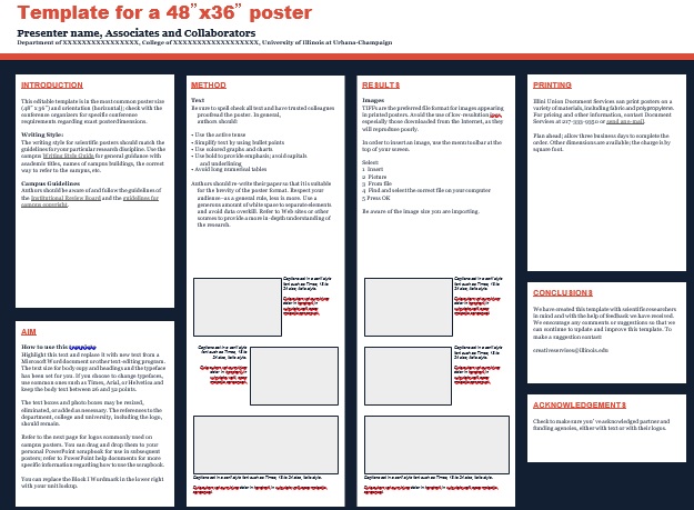
Most people use standard size i.e. 48-inches x 36-inches in landscape orientation. You feel free modify the size if this is too small or too big for you. If a portrait orientation works with your content then there is no problem with using it.
Background:
You should make your posters background in such a way that it doesn’t distract the viewers. Therefore, most people use white or other light colors for their backgrounds. You can also use subtle gradients until these don’t grab attention from the rest of the components on your poster. The things that you should avoid are distracting colors, busy patterns or even photo backgrounds. You should use white color for your text if you want to use a dark color. This makes it more readable.
Styles of the title and headings:
The best posters make the viewers able to see the titles and headings clearly at a glance. This way, your viewers easily know what your poster is all about. You should use boxes, strategic colors, bold text, and a lot of whitespaces in order to ensure that these elements standout.
Fonts:
When it comes to fonts, you should make sure that they are readable. Along them, it is already up to your own choices. For the title and all the headings, one good principle of design is to use a single font. In addition, use a different font for the rest of the text.
Ensure that all the most important text of your poster should be clearly read from a normal distance. Basically, you have to make sure that the viewers who aren’t right in front of your poster can easily read what is written on it. For the fonts, you should set a good spacing. This adds to their readability.
Colors:
In your research poster template, the color scheme is an important element. Use various colors that grab the attention of the viewers and explain the most important information too. For your own brand, it’s best to use the same colors but this isn’t a requirement. You may want to opt for neutral colors if you want to select different colors. You can also use just one bold color which you may use sparingly.
Alignment and whitespace:
You must align all the elements well in order to make your poster to look professional. There is no need to align all the elements on the left, the right or the center. You can use various alignments unless you ensure that everything looks systematize and there is nothing out of place.
In the end, in your poster design, you should assure that there is enough whitespace between each of the elements. Your poster should have more whitespace so that you can more explain the most important elements.
Some tips for your research poster:
Here are some tips that you should keep in mind while preparing a research poster;
Less is more
You have to go for a simpler layout when it comes to the design of your poster rather than a loud and distracting one. Don’t add cute graphics and other irrelevant elements because it is an academic poster template. Your viewers easily understand it if it is made simple.
Avoid clutter
If you use too many elements, it becomes difficult for viewers to find the most essential information. Distinguishing the sections from one another becomes challenging by a cluttered poster.
Before having the poster printed, perform a final check
Perform a final check on the poster before printing it. Make sure that your poster is free of spelling or grammatical errors and everything is easy to read and understand.
Conclusion:
In conclusion, a research poster template is a useful document in which information is organized into sections that include paragraphs, charts, photos, and other elements. This document acts as a visual representation of information that you have consolidated and organized into a format.
Faqs (Frequently Asked Questions)
You can use the following software to make a poster;
1- PowerPoint
2- Adobe Illustrator
3- Photoshop
4- InDesign
5- Open Source Alternatives
A good research poster presentation contains;
1- Gives a clean and consistent layout
2- Explain research questions and results
3- Use purposeful graphics and visuals
4- Have readily accessible text
5- Include citations and contact details

